Banner Day in Downtown P.G.
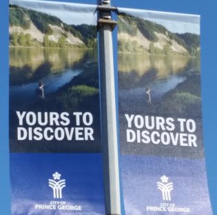
New banners in downtown Prince George – photo 250news
Prince George, B.C. – The new banners for Downtown Prince George and along the bypass are in place.
The banners, made possible through a partnership of Downtown Prince George, the City and the Rotary Club of Prince George, were put in place overnight on Third Avenue and George Street.
110 banners have been added in the downtown, while more than 300 others will be placed along the major highways.
The City’s budget for the project was $25 thousand dollars, but Downtown Prince George and the Rotary Club of Prince George kicked in some extra ($3,800) to upgrade the quality of the banners and to have the Downtown Prince George branding added to the ones displayed in the downtown.
The banners along the bypass feature three different images, Mr. P.G., the Art Gallery and clock tower, and a child on the banks of the Nechako River with the cutbanks in the background ( shown in image at right) .
The new banners are vinyl and are expected to last longer than previous banners that have been used in the City.
Reaction to the banners along Third Avenue was mixed this morning.
“They’re not stunning but they look okay,” said one woman to 250News. “It’s a good colour scheme – it’s nice and clean. I do like them,” countered another.
Regardless, locals seemed to appreciate the effort.
“Looks good, I hadn’t even noticed them yet,” said one man. “But I do think that anything to make the city look better is always good.”


Comments
Yours to discover is Ontario’s logo
that has WHAT to do with this? because it has explore in it? allrighty then
All three words are the same. They’re even in the same order. All this money and we had to copy a slogan?
Not the same. They don’t have “sandbanks”. They have ” cash banks” :)
What about Sandbanks Provincial Park which sits on Lake Ontario near Belleville, and has enormous and expansive sand bars and dunes as its main feature? LOL :)
Okay, let me rephrase. They don’t have the famous “cutbanks” that we do.
If our river rises up to an unprecedented height, we won’t have them either….lol
READ!!!!!
British Columbia: Splendor sine occasu, Meaning “Splendour Without Diminishment” in Latin, British Columbia’s provincial motto was designed by Rev. Arthur Beanlands and was first adopted in 1895.
BC’s special edition “The Best Place on Earth” license plate is intended to support the 2010 Winter Games. 130,000 have been issued since October 23, 2008. Source: http://www.bcpl8s.ca/Olympics.htm
he B.C. government’s “Best Place on Earth” slogan has been consigned to the dustbin of provincial brand history.
The decision to jettison the chest-thumping slogan has nothing to do with any change in the prideful phrase’s accuracy, said David Greer, communications director with the Ministry of Labour, Citizens’ Services and Open Government.
“The change in leadership signaled a change in how government brands its products and materials,” added Greer, saying the slogan was dropped a few months ago.
“It’s not going to be destroyed. It’s just not being replaced.”
While the “Best Place on Earth” slogan will no longer appear on new government letterhead, business cards and electronic or web-based materials, the logo of a rising sun and mountain that once accompanied the brash slogan will live on.
After dropping it in 2011, officials embraced “Super, Natural British Columbia” (actually a 30-year-old slogan brought back to life),
Prince George, Hub of the North
Isn’t google awesome!
“BC the best place on earth”, I like it, it has a nice ring to it.
ht tp://tinyurl.com/hrruwnn
Not only Ontario, which has been using the slogan for some 35 years for the entire province, but here is a complaint about Twitter using it.
adweek.com/socialtimes/twitter-ontario-yours-to-discover/458162
We are a very provincial city, aren’t we?? Not too many people are observant. I guess Ontario should have trademarked it.
charlesapple.com/uploads/2011/12/111208YoursToDiscover01.jpg
The plate ….
Comments for this article are closed.